Hi there!
It is been a while since my last post, and I wanted to come back with a fun little project! I have an instagram account where I mostly post food photos, with few followers, and I have the data of my posts reach, impressions, profile visits, likes, and comments. To create a common ground, “impression” means the number of accounts my content was shown to and “reach” stands for the number of accounts clicking on my content.
I visualized this data (n = 202) on Jupyter Notebook, and here you can see the whole content of this blog. I started by looking at the data and importing the necessary libraries: pandas and seaborn:
import pandas as pd
import seaborn as sns
df = pd.read_excel('/Users/xxx/Desktop/Instagram.xlsx')
df.head()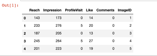
First, let us see the count of likes! (Everyone’s big deal on Instagram I guess!:)
sns.countplot(x = 'Like', data = df)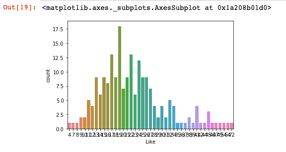
Well, this does not seem to be readable, we need to change the figure size. One thing I like about python is that its syntax is quite intuitive for me compared to R. To change the figure size (the argument name is figsize, could this get more intuitive?), we will get help from matplot lib library:)
from matplotlib import pyplot as plt

plt.figure(figsize=(15,8))

sns.countplot(x = 'Like', data = df)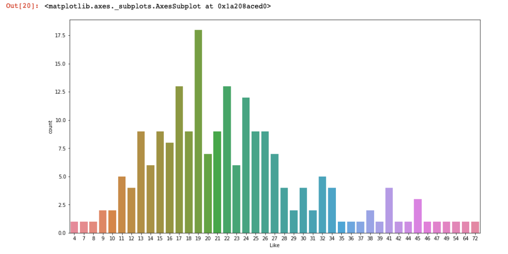
Ok, so, now we all know that my poor account content rarely get as few likes as 4 or as many as 72. Let us check the distribution of “likes” with a distplot (again so intuitive!):
sns.distplot(df['Like'])
#distplot shows both an histogram and KDE (kernel density #estimate) line.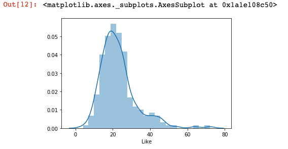
Now, let us see the relationships between “reach” and “like” with a jointplot.
sns.jointplot(df['Reach'], df['Like'])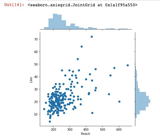
It looks like the more number of reached accounts, more number of likes. Well, hardly surprising, I know, still, nice to see that it is reflected on the actual data.
I will visualize the scenario where the number of likes is predicted by using the number of reached accounts (“reach”) as a predictor. (Note: lmplot is used to plot regressions, for more info, check out the seaborn documentation).
sns.lmplot(x = 'Reach ', y = 'Like', data = df, line_kws={'color': 'red'}, scatter_kws= {'color': 'black'})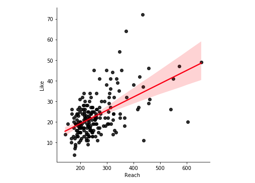
The direction of the relationship is shown once more (of course, to see the significance etc. we would need to calculate regression, but for the sake of being concise, I am only doing visuals today!). Now, let us see the figure for the number of reached accounts being predicted by the number of impression:
sns.lmplot(x = 'Impression', y = 'Reach', data = df, line_kws={'color': 'red'}, scatter_kws= {'color': 'black'})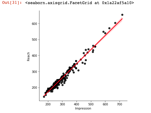
Even though it is a real data, it looks very clean, do not you think? I loved it. Now, let us see the figure where the number of profile visits is predicted by impressions:
sns.lmplot(x = 'Impression', y = 'ProfileVisit', data = df, line_kws={'color': 'red'}, scatter_kws= {'color': 'black'})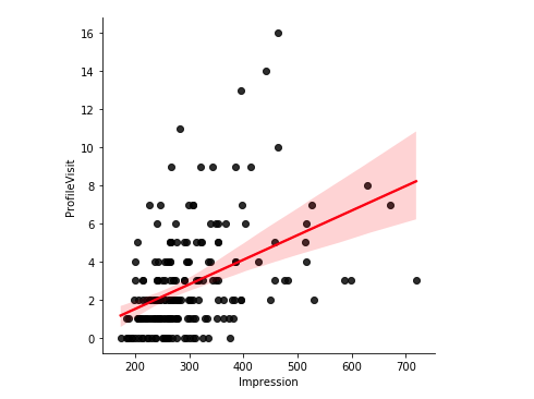
What if we want to see the relationships between each pair of variables? Seaborn has a great solution:)
sns.pairplot(df)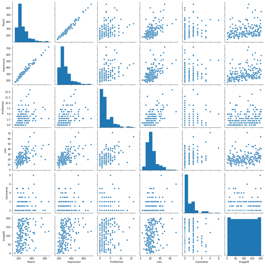
By the way, seaborn also allows us to use three variables in a scatterplot. For instance, we can check the relationship between “reach” and “imageID” (I gave unique numbers to each image on my instagram posts), and we can see different coloring based on the number of likes those images got. I will use “coolwarm” as a color palette, so, smaller numbers will be indicated with blue and bigger ones with red tones. Let us see how this will look like:
df.plot.scatter(x = 'Reach ', y = 'ImageID', c = 'Like', cmap = 'coolwarm')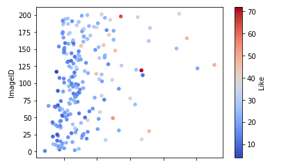
Hope you enjoyed this little introduction to seaborn and its capabilities!
Cheers!