The last time I wrote about data analysis, I shared how to navigate through the data and how to do the basic descriptive analysis. Now, high time to start diving in, and do some analysis such as correlation!
For that we will install SciPy, Pandas, and Matplotlib libraries. I will talk about three different correlation types (Pearson, Spearman and Kendall) and yes I know there are more types:). We will import Pearson, Spearman, and Kendall from scipy.stats. We should also read the data file, which in this case, I named it as: Correlation.csv
import pandas as pd
from scipy.stats import pearsonr, kendalltau, spearmanr

import matplotlib.pyplot as plt

df = pd.read_csv("/Users/the path/Correlation/Correlation.csv")
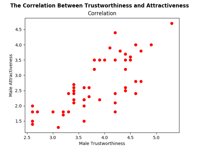
For this blog, I will look at the correlation between perceived attractiveness and perceived trustworthiness of the male images. Let us first have a look at the data by the help of a scatterplot. For the scatterplot, we are using the mathplotlib.
#for scatterplot:

plt.scatter(df['MaleTrustworthiness'], df['MaleAttractiveness'], color='red')
plt.xlabel('Male Trustworthiness')
plt.ylabel('Male Attractiveness')
#supertitle:
plt.suptitle('The Correlation Between Trustworthiness and Attractiveness', fontsize=12, fontweight='bold')
#title:
plt.title('Correlation')
plt.show()
Here is the resulting scatterplot:

As you can see “suptitle” is the supertitle above, and we can also write a regular title below. The rest of the code is almost like plain English, so we are good to proceed!
For the moment, let’s assume that our data does not violate the parametric assumptions (we have not checked it to keep the blog compact). Pearson correlation is a way to go. Probably, we would also like to see the p-value.
d = pearsonr(df['MaleTrustworthiness'], df['MaleAttractiveness'])
print(d)
The result is r : .75 and p: 3:4712…e-10:
This result shows that perceived attractiveness and trustworthiness are strongly correlated and this correlation is significant (p<.05).
If our data is non-parametric, then we should either calculate Spearman’s rho or Kendall’s tau. Spearman correlation first ranks the data and then applies the Pearson equation. Let us start with calculating the Spearman correlation:
e = spearmanr(df['MaleTrustworthiness'], df['MaleAttractiveness'])
print(e)
The result is, rho: .76, p: 1.375…e-10.
To calculate the Kendall’s tau, just change the spearmanr to kendalltau. Then, you are done!
PS: You would prefer Kendall’s tau, when: you have a non-parametric data, smaller data set, and a large number of tied ranks (i.e., many data points have the same rank).
R Square For Interpretation:
We can use R square for interpretation. To do that you just need to square the r value. Our r value was .75, and its square is .56. It means: 56% of the variability in perceived trustworthiness shared by perceived attractiveness. The remaining 44% can be explained with other variables. However, do not forget that we can use R square for Pearson and Spearman correlations only!
Cheers!